






Recognitions:
This project was featured at Experimenta Magazine - Revista de Diseño. Gráfica, Arquitectura, Industrial y Tecnología from Spain, featured in this link here: Dandara Hahn y los límites del papel.
This project was featured at Experimenta Magazine - Revista de Diseño. Gráfica, Arquitectura, Industrial y Tecnología from Spain, featured in this link here: Dandara Hahn y los límites del papel.
Papel como expressão gráfica e visual
Scope:
Editorial Design
Reasearch
Writing
Team:
Papel was all made and created by me, for my graduation in Communication Design final project, at Escola Superior (ESPM-SP), with the guidance of the great Marcos Mello - designer and letterpress printer, owner of Oficina Tipográfica São Paulo - OTSP was established in 2004 and operates as both a digital and an analogue letterpress design space; It allows the worlds of contemporary graphic design and printmaking to become connected through its location within the Escola SENAI Theobaldo De Nigris, a leading graphic arts school in Latin America specialising in printing technology.
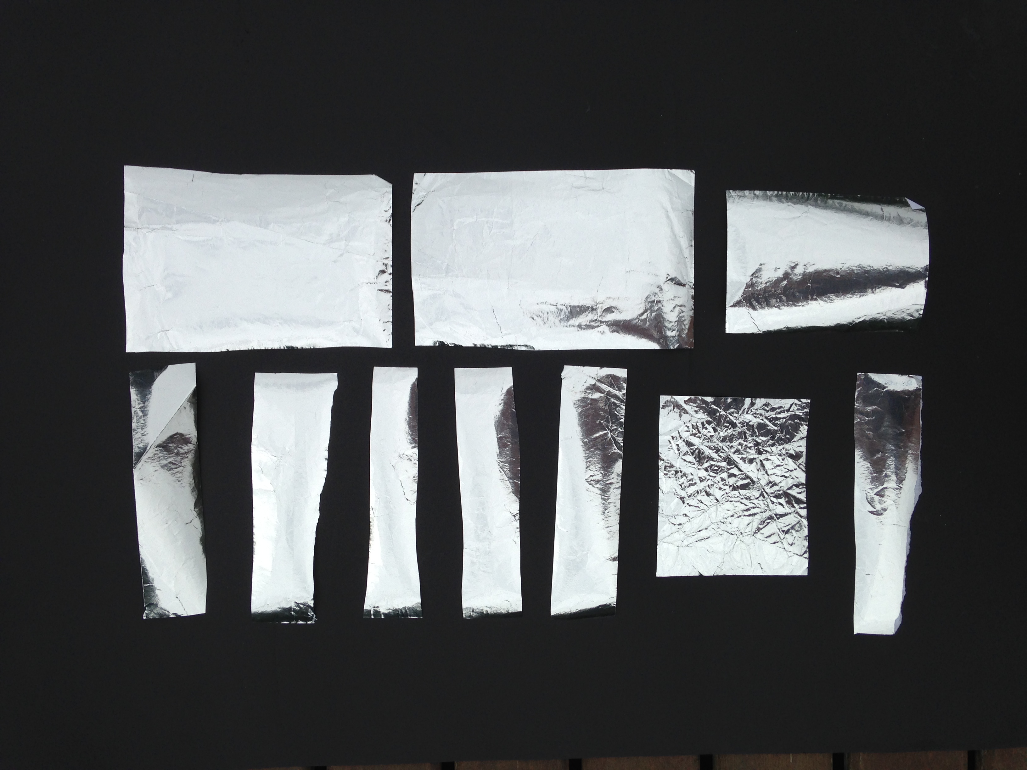
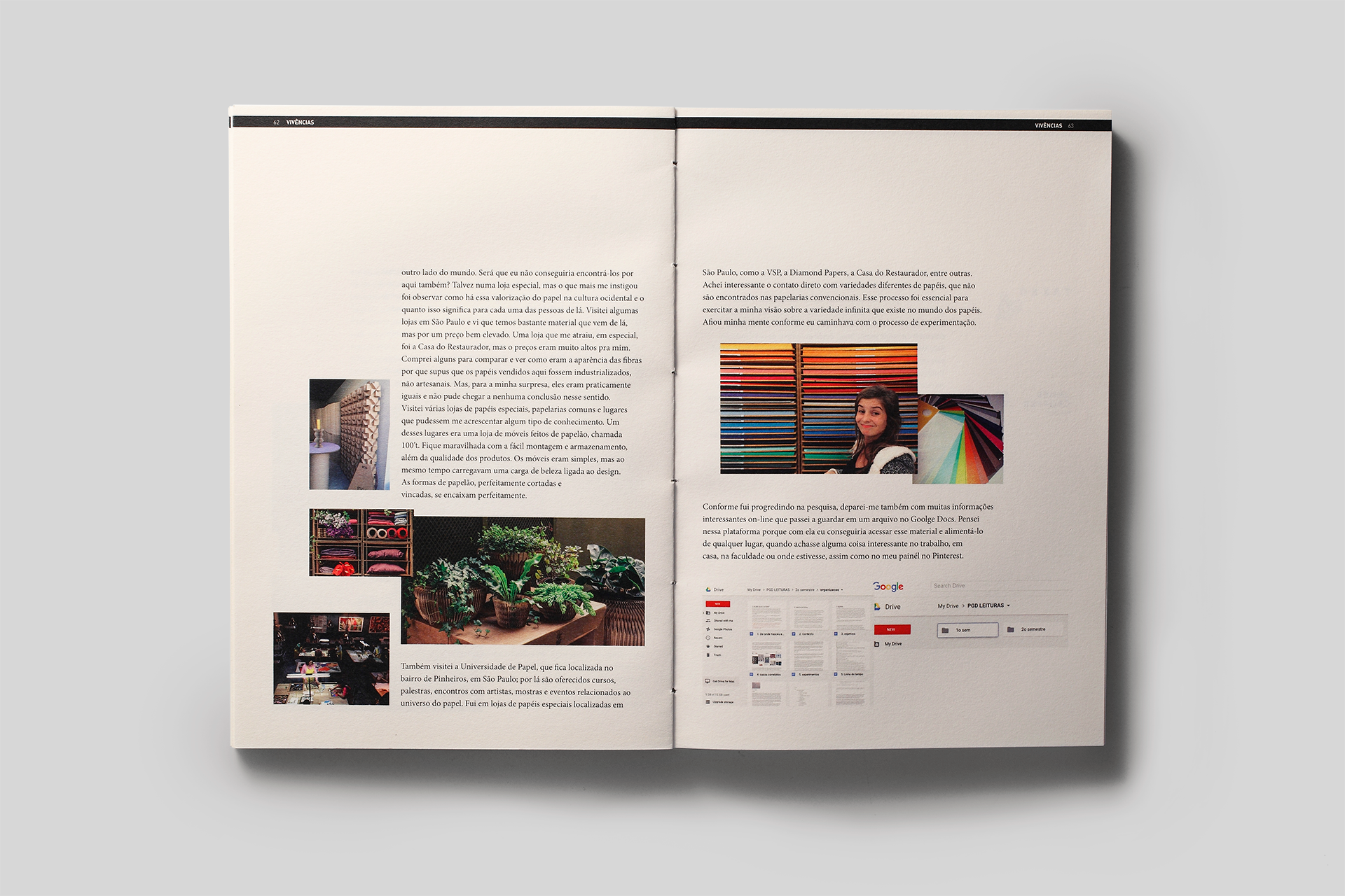
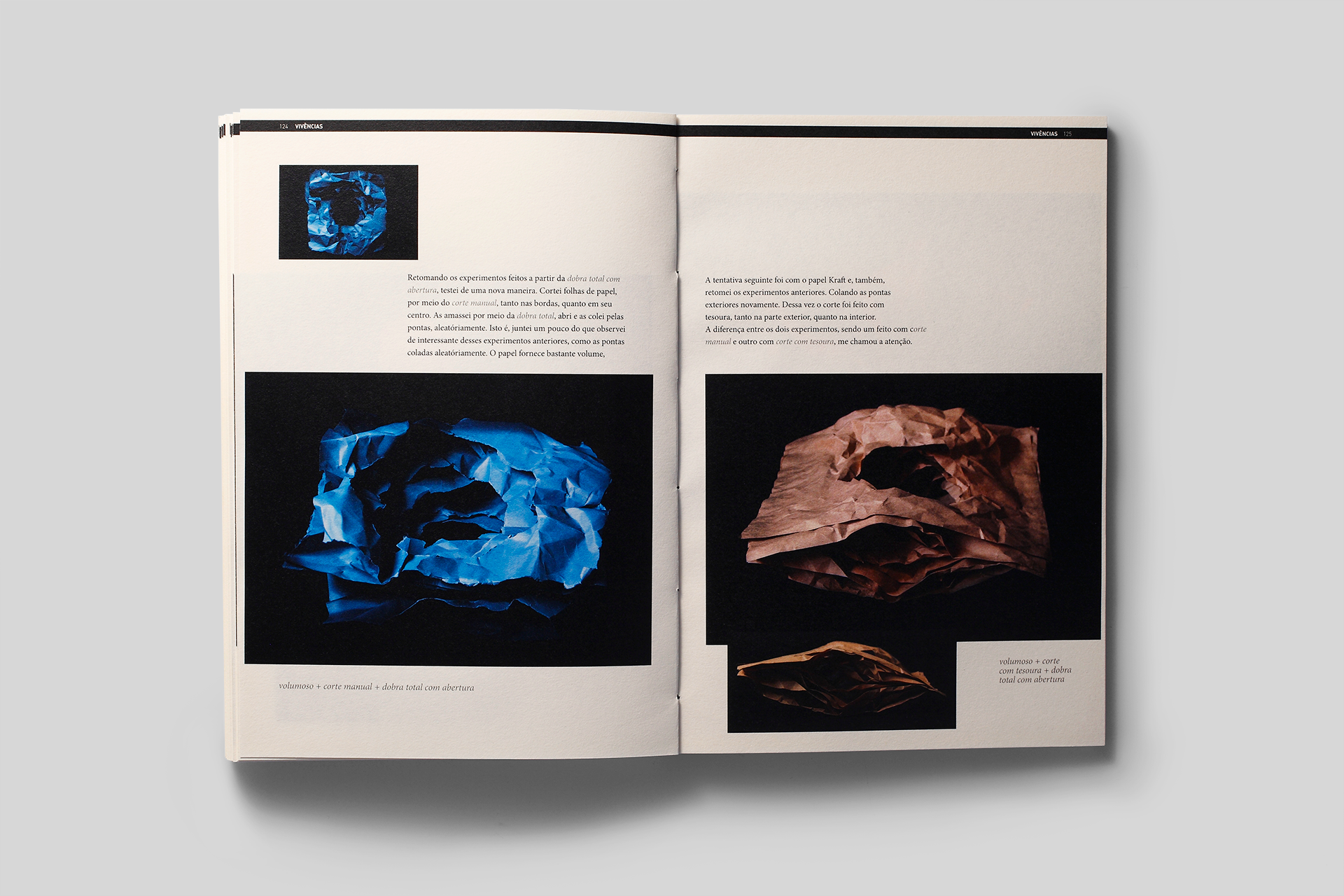
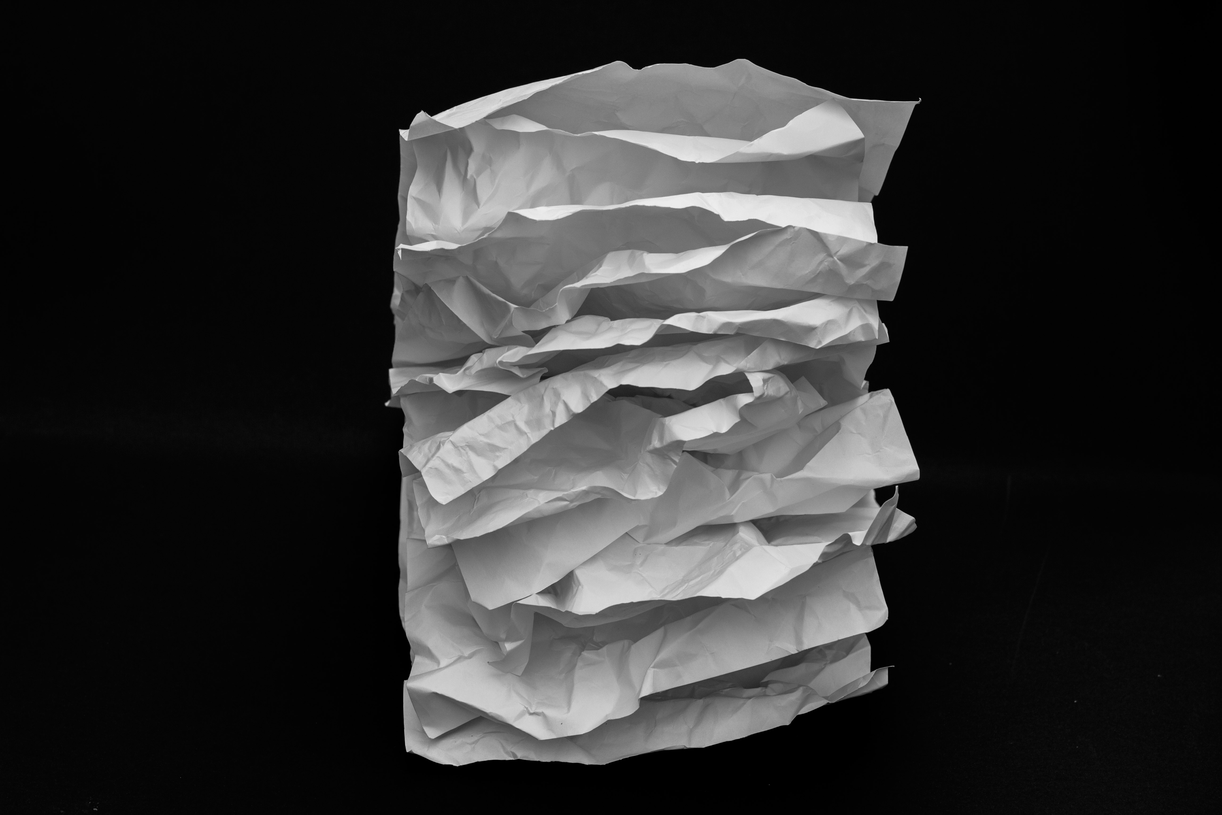
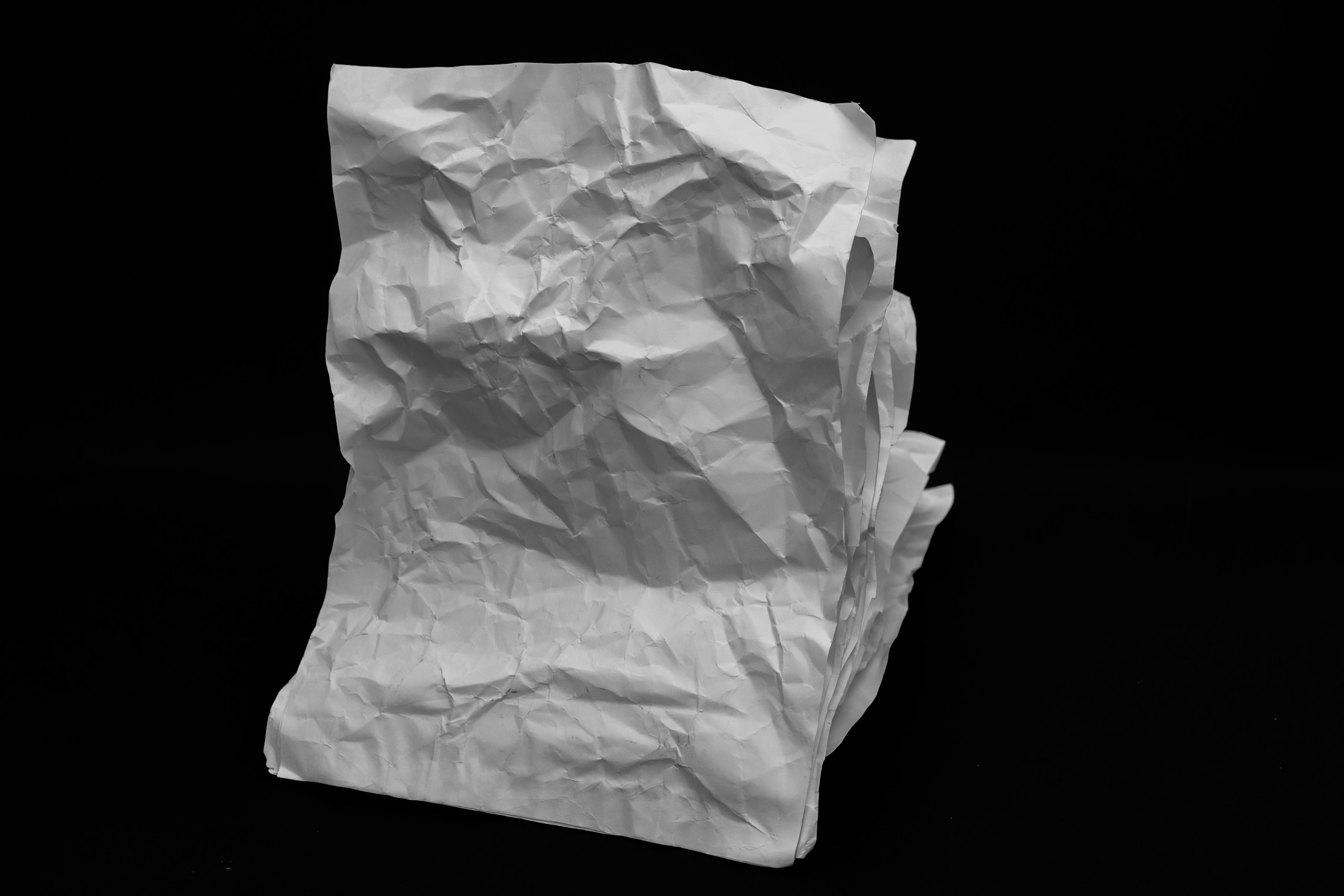
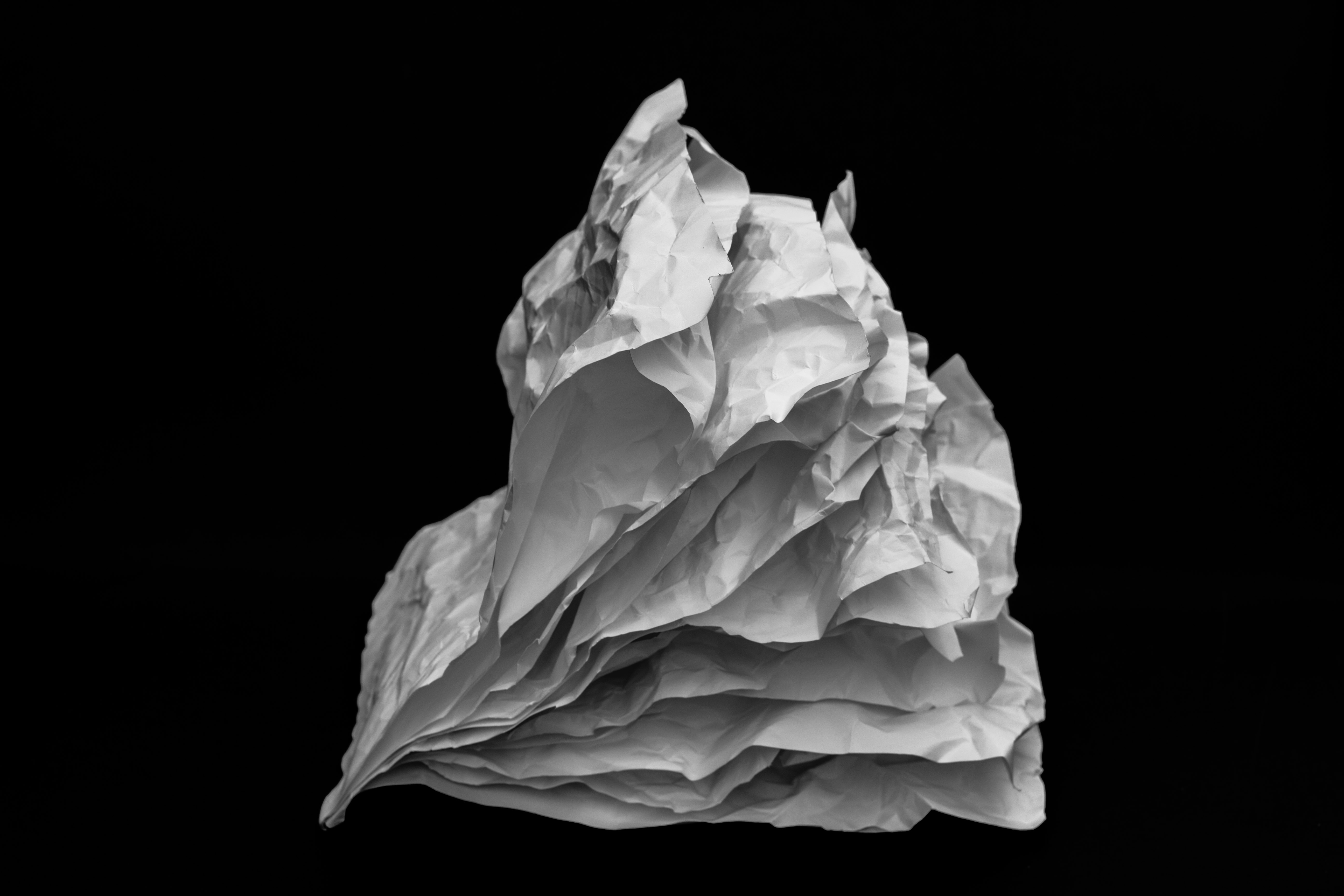
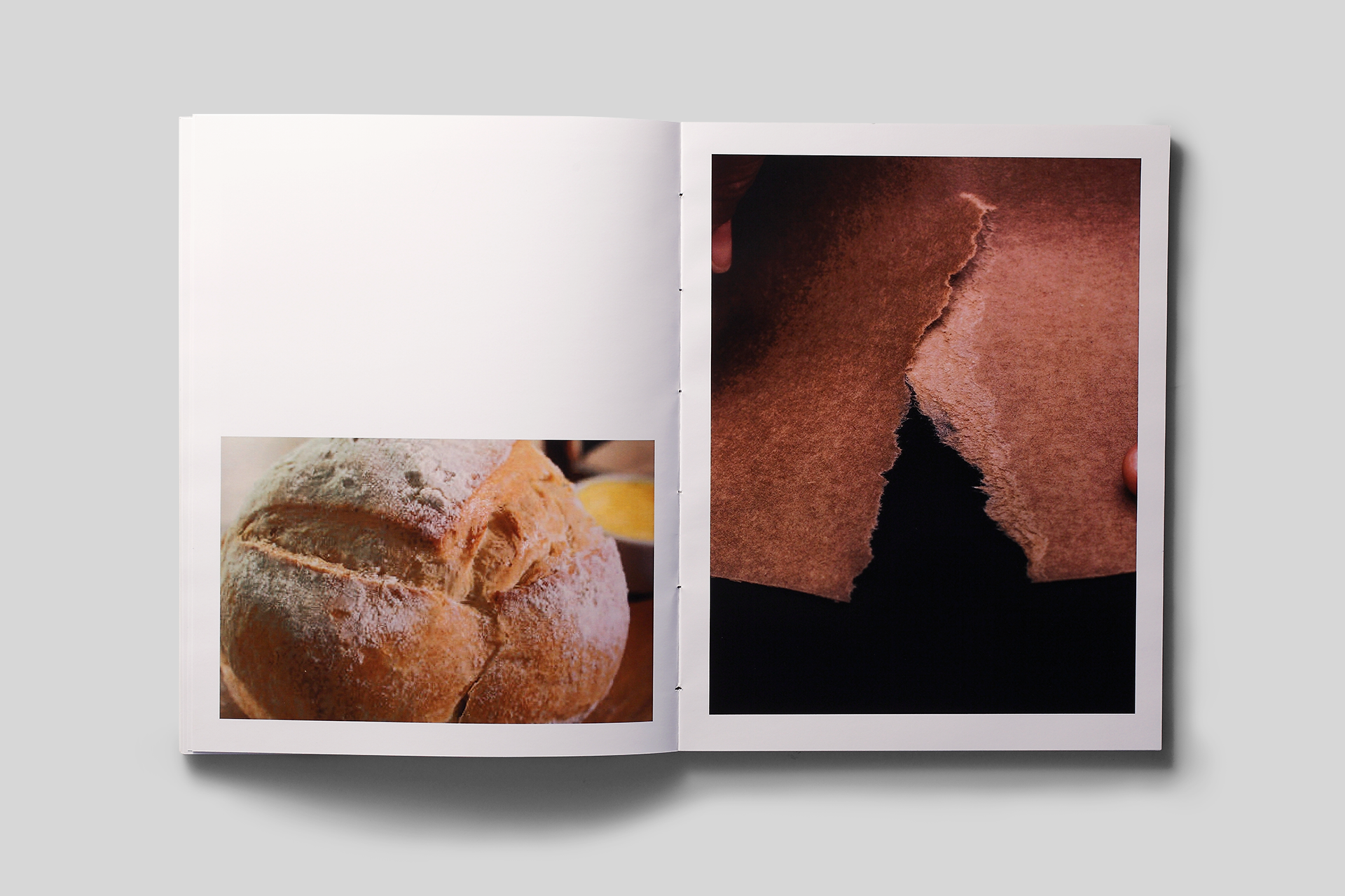
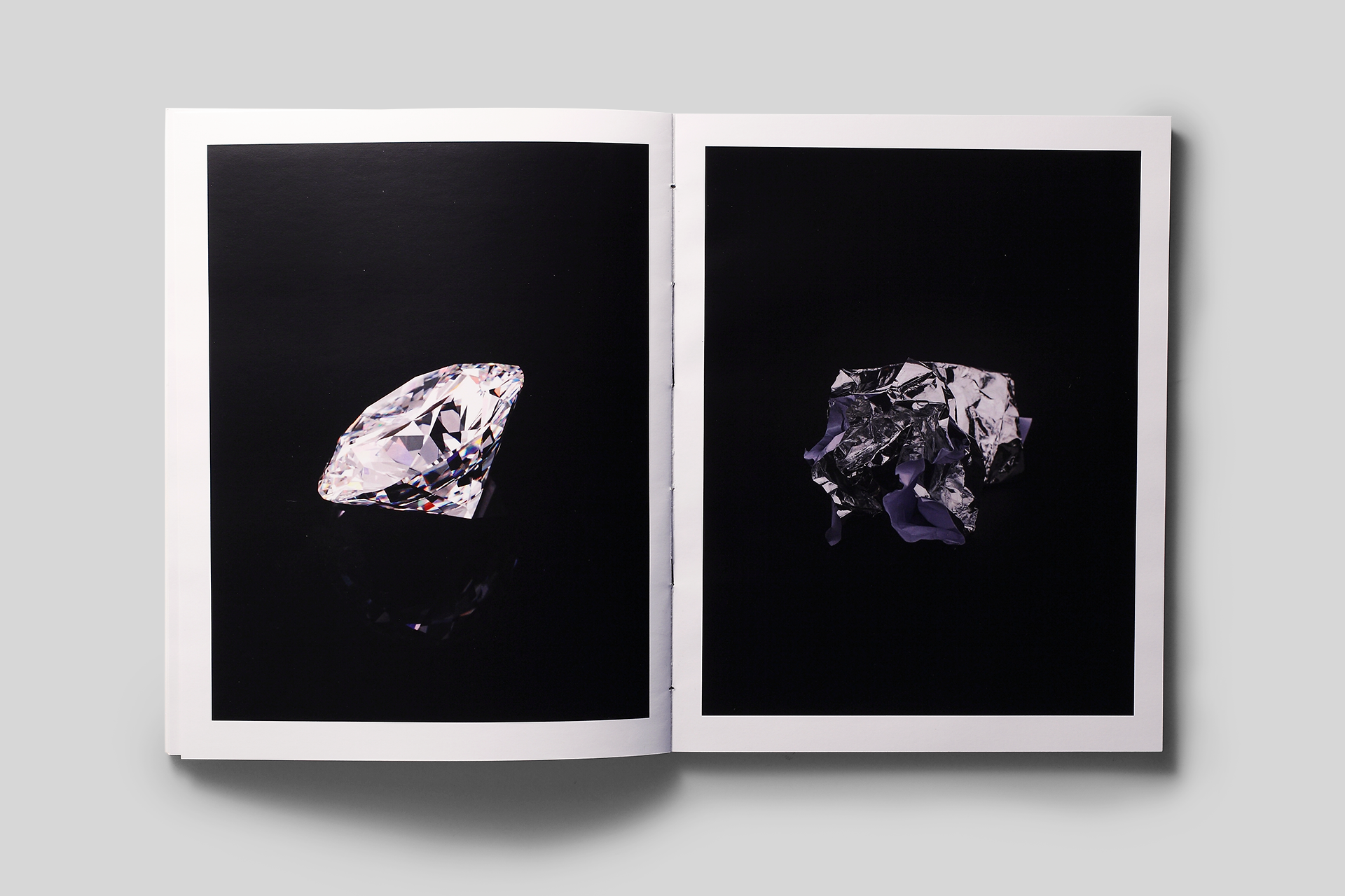
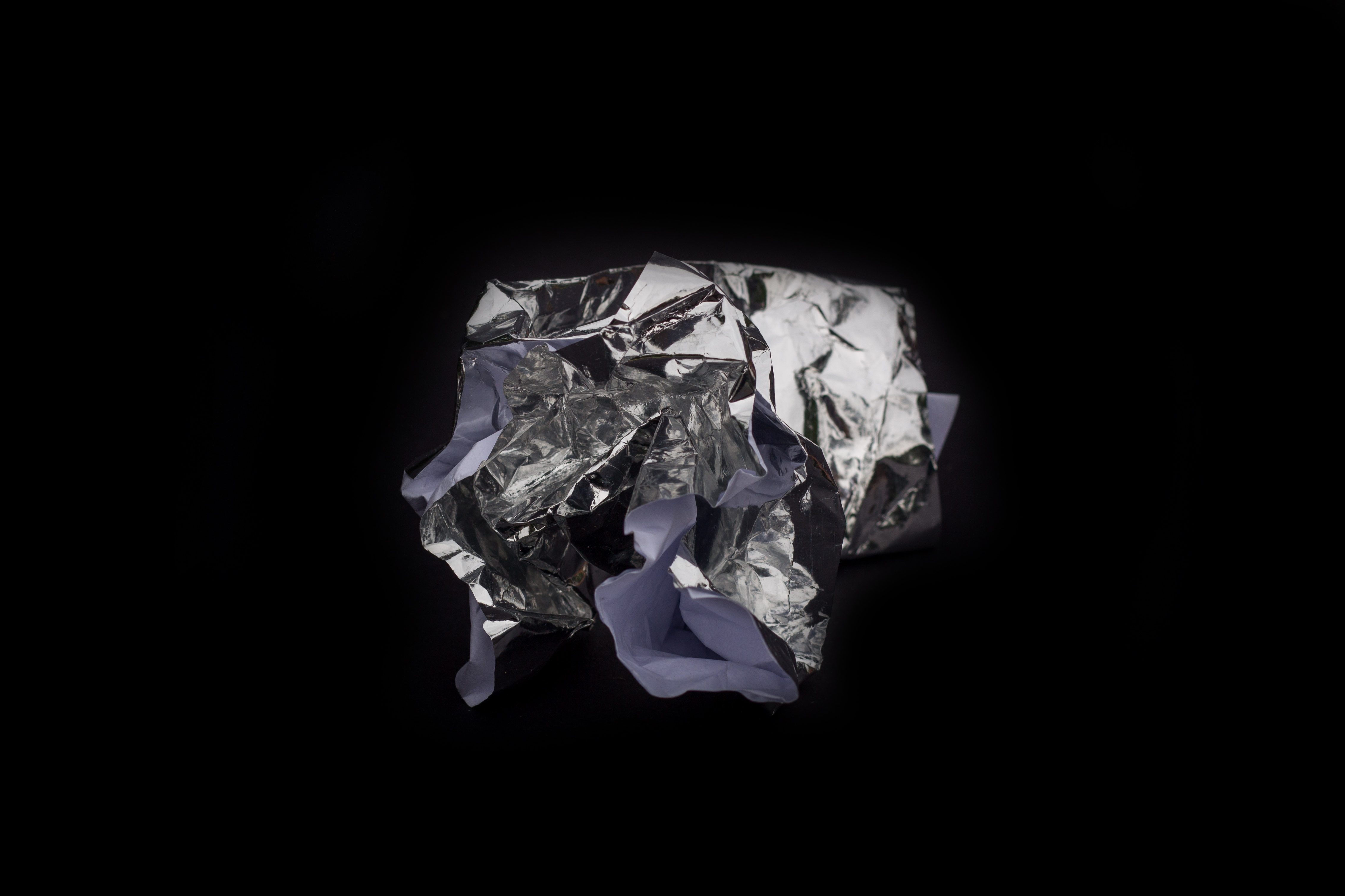
Through the process of researching about paper for a hole year, and experiencing it as an object, I produced different experiments with the intention of greatly expand the limits of the paper. In the main book, every moment of this journey is shown, from the first stages of experimentation, documentation of the hole process, references, and the results of the experimentations, such as sculptures and things that I thought. In the second book, I establish again this relation of transformation of the paper, with pictures of the sculptures that I made with paper, comparing them to real images that are in our daily lifes and through parallels with forms of nature, giving a new sense of resignification by images.
Printed on a short run, this was an experimental design project with paper as a material, and also a research about the history of paper and the entire context that permeates it today. The paper, which is a material made up of fibrous elements of plant origin, generally distributed in the form of sheets or rolls, comes from nature, from a transformation of materials. This projetct consists on two books that works togeter.
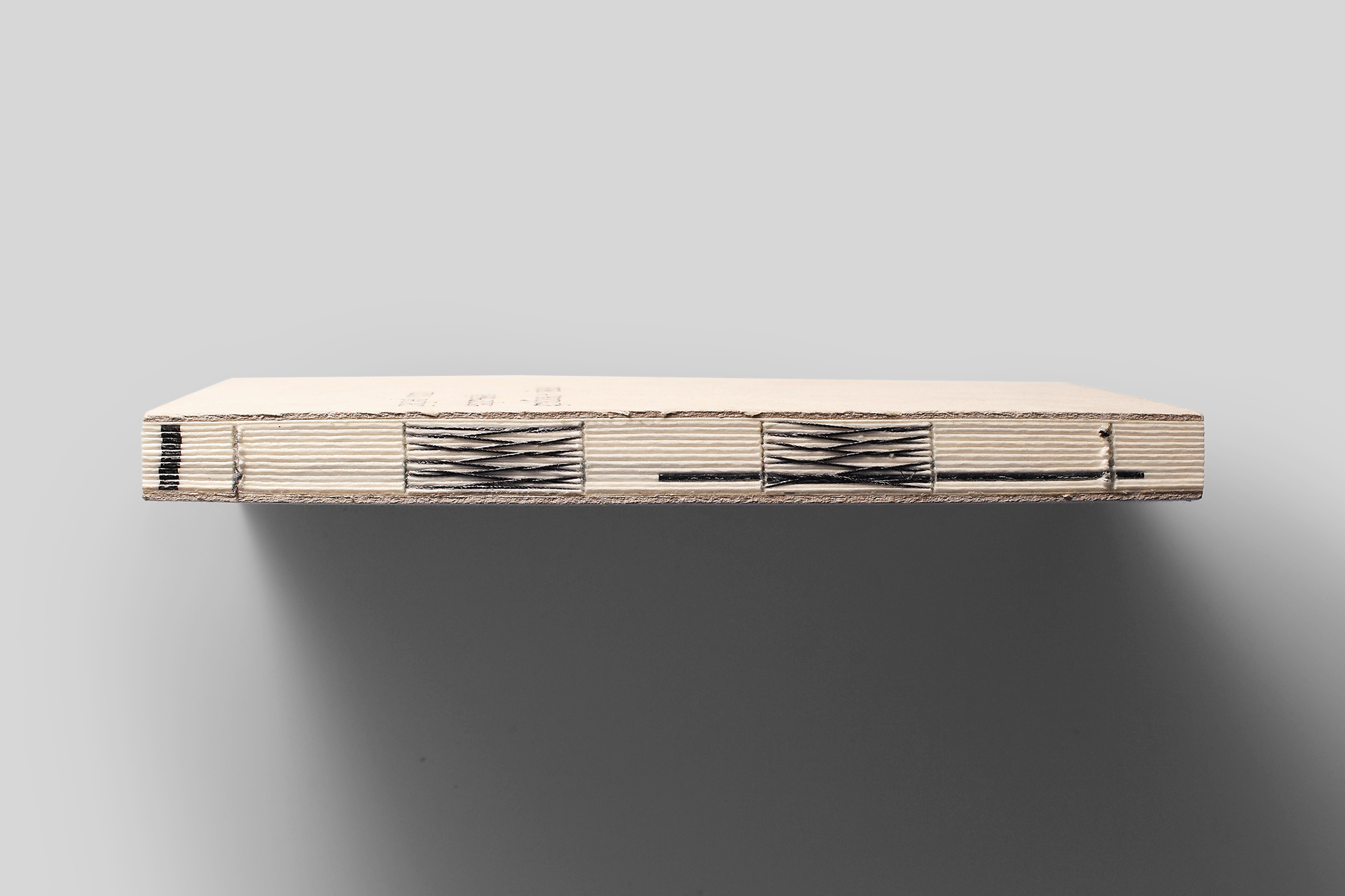
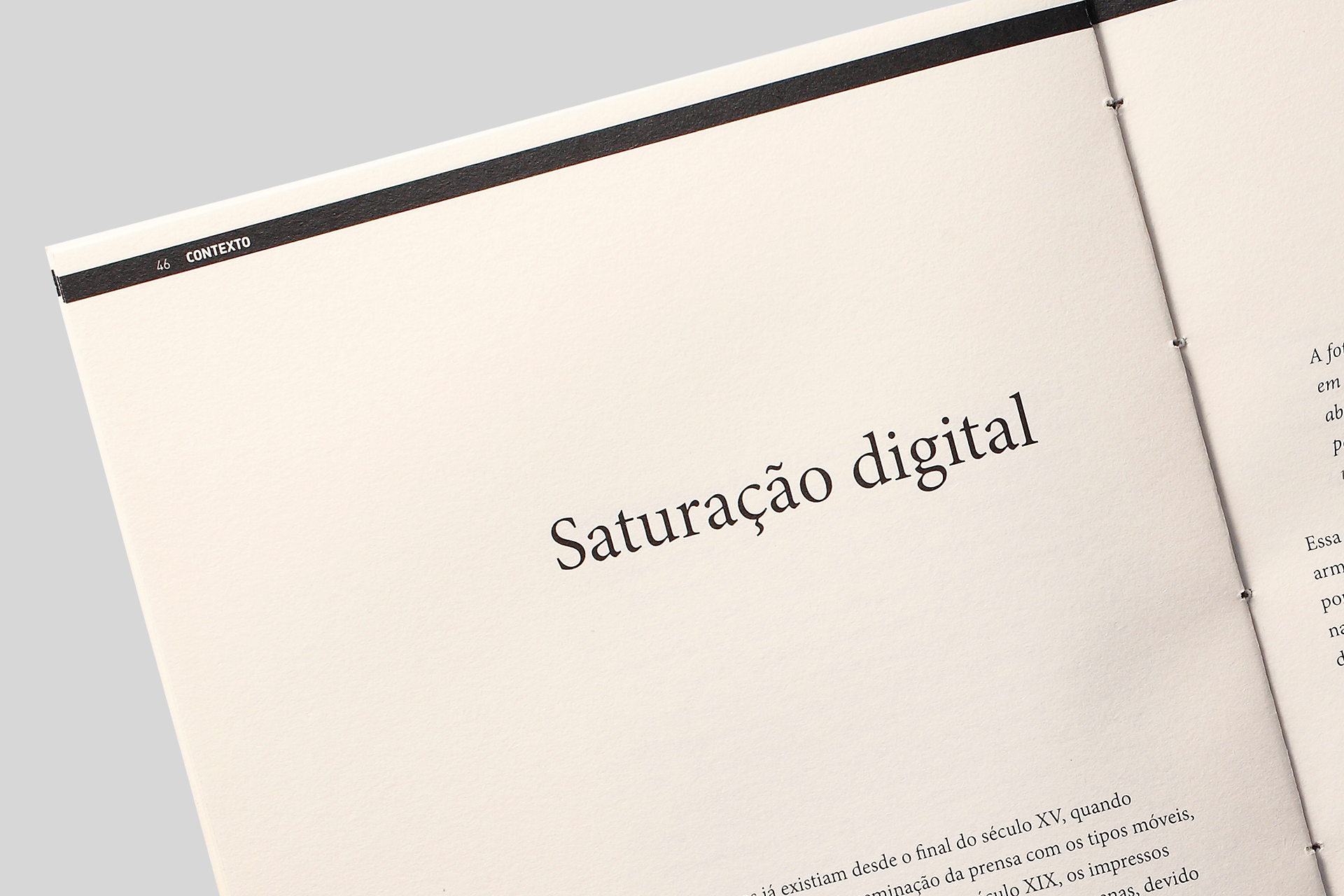
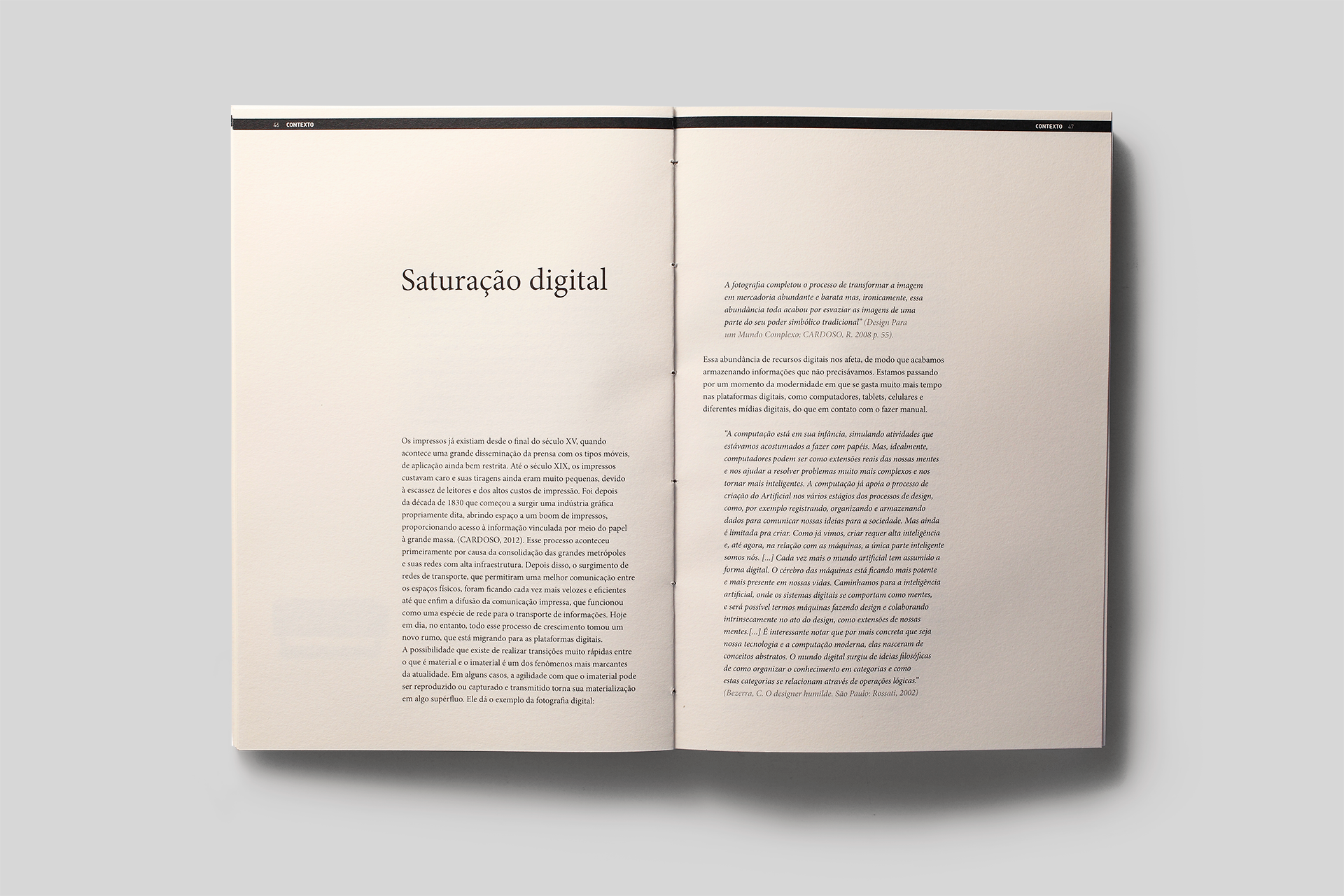
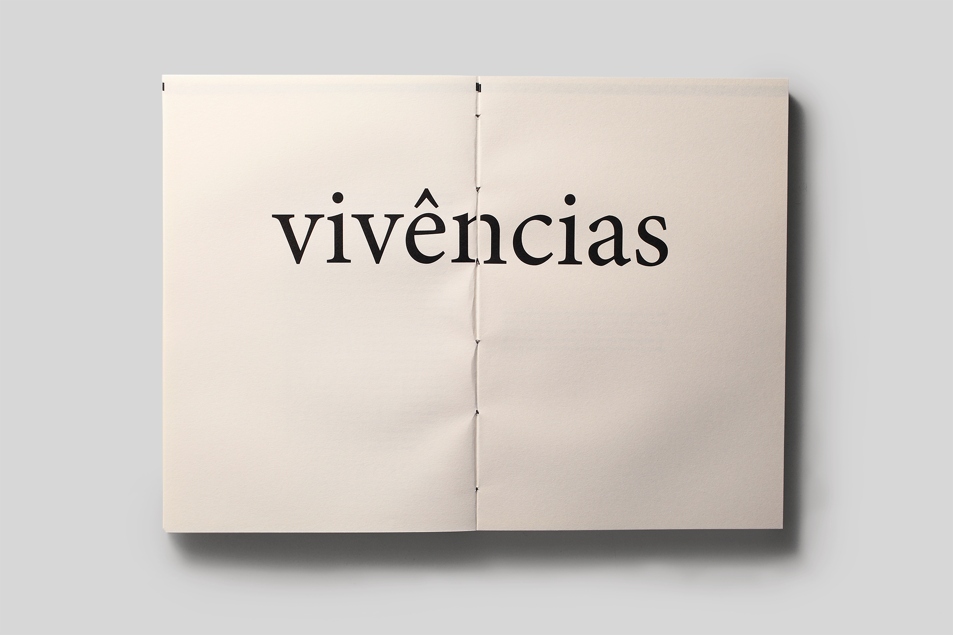
On the graphic project, there was a special care to bring out the paper’s essence, through the use of paper on it’s purest form, with simple and rustic finishes. The paper is pollen bold. All the editorial project was made with Minion Pro, an Adobe Original typeface designed by Robert Slimbach. This font combines the aesthetic and functional qualities that make text type highly readable with the versatility of OpenType digital technology, yielding unprecedented flexibility and typographic control, whether for lengthy text or display settings.
Scope:
Editorial Design
Reasearch
Writing
Team:
Editorial Design: Dandara Hahn
Writing: Dandara Hahn
Orientation: Marcos Mello
Book portfolio images: Mariana Valverde
Book Sculptures images: Caio Prat
Fonts:
Minion Pro by Adobe
Writing: Dandara Hahn
Orientation: Marcos Mello
Book portfolio images: Mariana Valverde
Book Sculptures images: Caio Prat
Fonts:
Minion Pro by Adobe